03 PUBLICATION FOR CONVENTIONS
PUBLICATION
CONTEXT
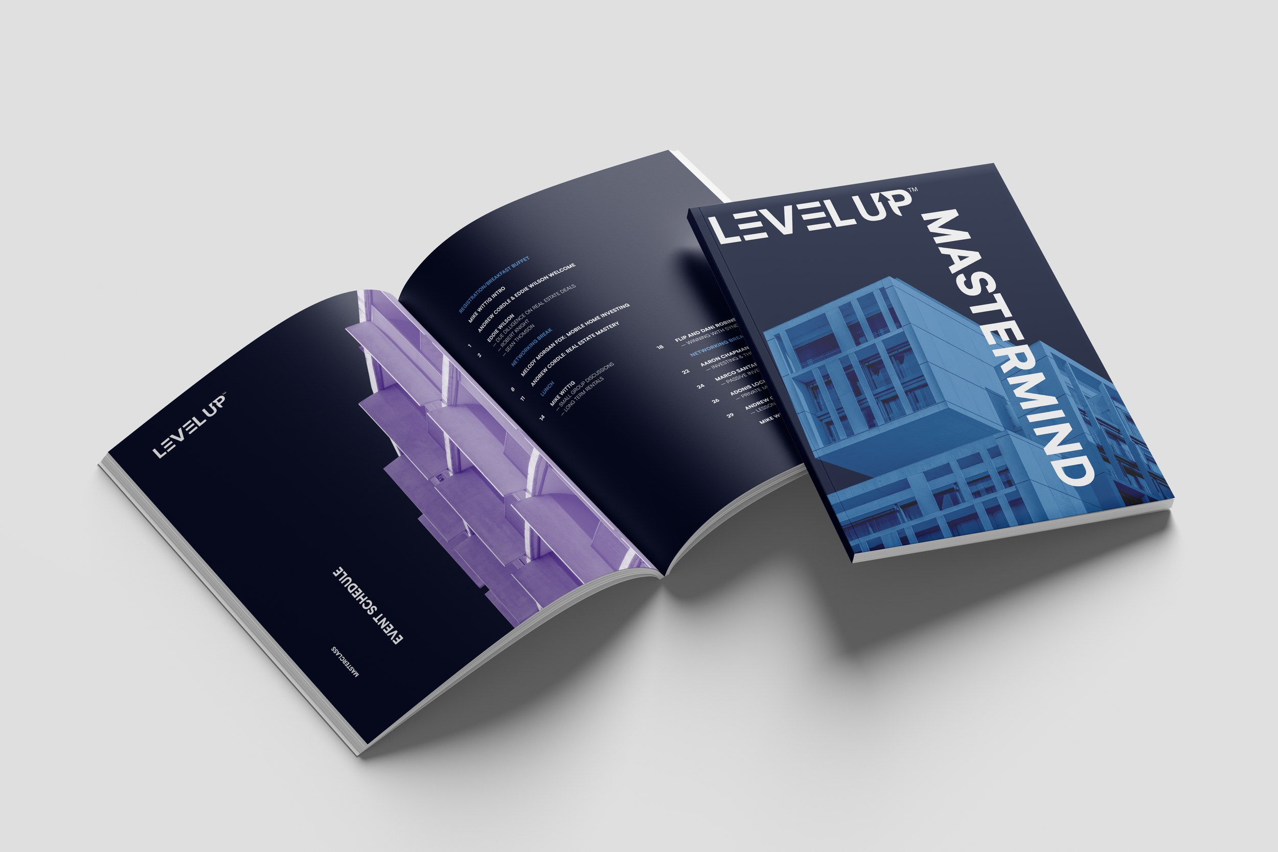
During my tenure as a graphic designer at Collective Influence, I had the opportunity to work on magazine-style workbooks distributed to clients attending the company's masterclasses.
One notable project was a workbook for LEVELUP, a real estate investment subsidiary of Collective Influence. This workbook featured testimonies from real estate investors, showcasing the success and wealth achievable through strategic investments.
The visual aesthetic was inspired by brutalist architecture, utilizing limited colors, clean typography, and precise spacing. This design choice reflected the meticulousness required in both architecture and investment decision-making.
TIMEFRAME: 2 weeks
ROLE: GRAPHIC DESIGNER
INVOLVEMENT: Independent Work

OVERVIEW
THE SOLUTION
To create a workbook that embodied the company's values, I aimed for a clean, mathematical aesthetic with strict alignment. This approach was inspired by brutalist architecture, known for its adherence to structure and simplified design.
Many of the spreads feature a minimalist design paired with a notes page, allowing masterclass attendees to record their thoughts for each guest speaker.
FINAL DESIGN
REFLECTION
This project was particularly interesting because it embraced the "less is more" philosophy. It was also one of the first large-scale publications I designed.
Using a brutalist style for a real estate publication proved effective, as it avoids cluttering information. Investors need clear, precise details, and the meticulous attention to alignment and white space reflects the precision required in the industry. The straightforward design highlights guest speakers, ensuring attendees fully grasp their industry insights.
I look forward to working with this style more in the future.


