04 MIYA 93
UX/UI
CONTEXT
Miya 93 is an online magazine that focuses on highlighting women and their JDM (Japanese Domestic Market) vehicles.
The objective of this project was to design a multi-paged, high-fidelity interactive prototype. The goal was to visually communicate the website’s mission of highlighting women and their achievements in a motorsports world heavily dominated by men.
In this project, I designed a logo and multiple responsive desktop pages.
TIMEFRAME: 8 weeks
ROLE: UX/UI DESIGNER
INVOLVEMENT: Independent Work

OVERVIEW
THE STRATEGY
In my design, I aim to convince JDM enthusiasts that women make just as big of an impact in the motorsports world as men do.
The overall visual strategy was to ensure that the website feels sleek, but full of personality with pops of color representative in the look of JDM vehicles.
LOGO EXPLORATION
While ideating and iterating the brand logo, I experimented with several type choices and styles. I wanted the logo to feel Japanese but have a sleek and expressive feel. The wordmark is based off the font Planet Kosmos, which features rounded edges and long straights like that of a racetrack.
The end result of the logo is combination of a metallic car tag inside of a racetrack.
IDEATION
Based on the research and the proposed design problem, we want to achieve these goals for users:
Allow users to read the articles they want, when they want
Have new and hot topics weekly
Ensure that accessing all screens are seamless and fluid
WIREFRAMES
FINAL DESIGN
Homepage
The homepage features an expressive hero with a call to action that takes you directly to the featured article.
Magazine
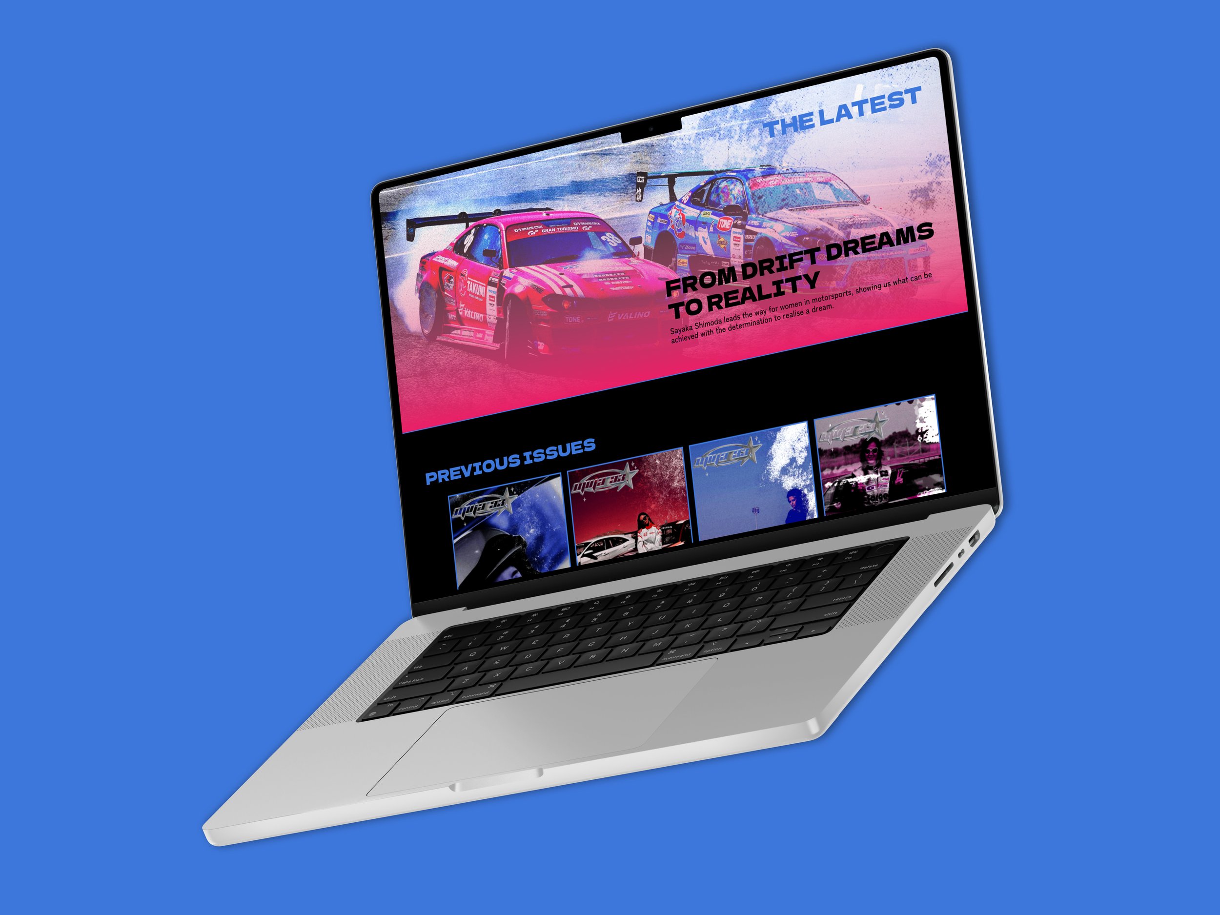
The magazine page highlights the featured article of the week and displays articles from previous issues.
Featured Article
The feature article highlights the JDM woman of the week with a long scrolling page broken into sections.
Shop
The shop allows user to wear the brand. With street-styled clothing, there are different colors for each clothing item.
Forums
The forums allows users to become a part of a community, ask questions and to create their own sub-forums.
REFLECTION
This was my first experience with a projects fully fleshing out a brand and the user experience. It was fun and interesting to push a logo across a concept to have it be the face of the brand. This project was also excellent practice in sharpening my UX/UI skills. I was able to experiment with different layouts and ultimately find something I felt was successful and would be well received by an actual audience. I would love to expand on this project in the future and even take the articles to a print format.


